Xplore
Hart House
Hart House, University of Toronto
Xplore Hart House is the yearly orientation event for the start of the academic year at Hart House, University of Toronto. It is the largest single event for the organization and is heavily marketing towards students and the community, to spark engagement and showcase all of Hart House’s offerings: programming arts, dialogue and wellness, spaces/event rentals, the fitness centre, the two eateries, the theatre, and the building in general as a community gathering place.
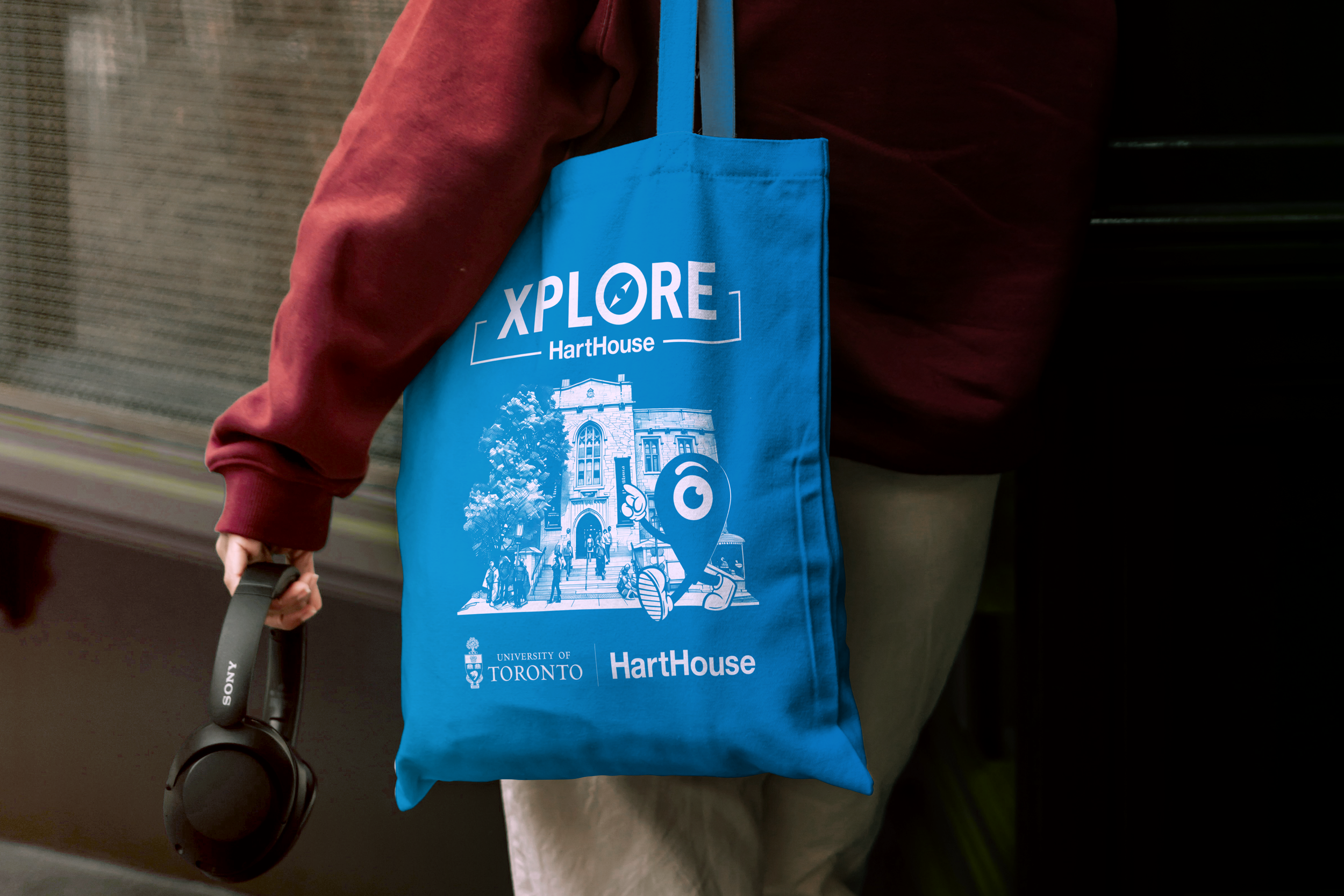
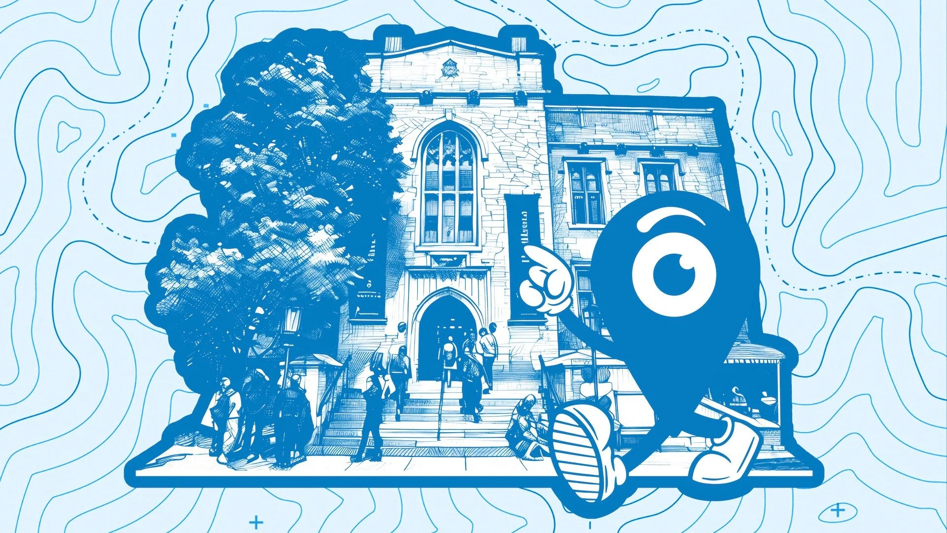
I created a specific branding and logo for the event, as well as a mascot that was featured on various items, swag, ambassador t-shirts, digital & physical signage, social media campaigns and the website. The logo Xplore focuses on a tie-in with orientation (X marks the spot) and the mascot is the navigation icon as a caricature. The mascot was further expanded to represent each of the key aspects of Hart House’s mandate (arts, dialogue, community, etc). Hart House has specific branding colours, and I chose the Hart House Blue as the signature colour for all items, as this is the general colour that represents Hart House within the U of T community. It also ties in with the external signage and banners on the building.
I also helped design and created all the assets for the Xplore Microsite, working and collaborating with the web development officer on the marcom team.
I wanted to create something fun and engaging to represent the tone of the event and create a welcoming feeling for the visuals and collateral.
Web Hero Image
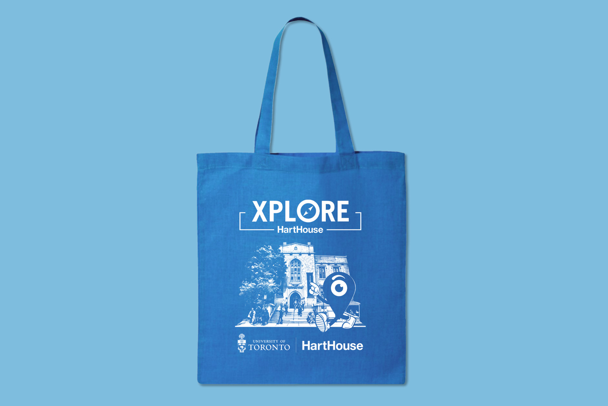
Tote
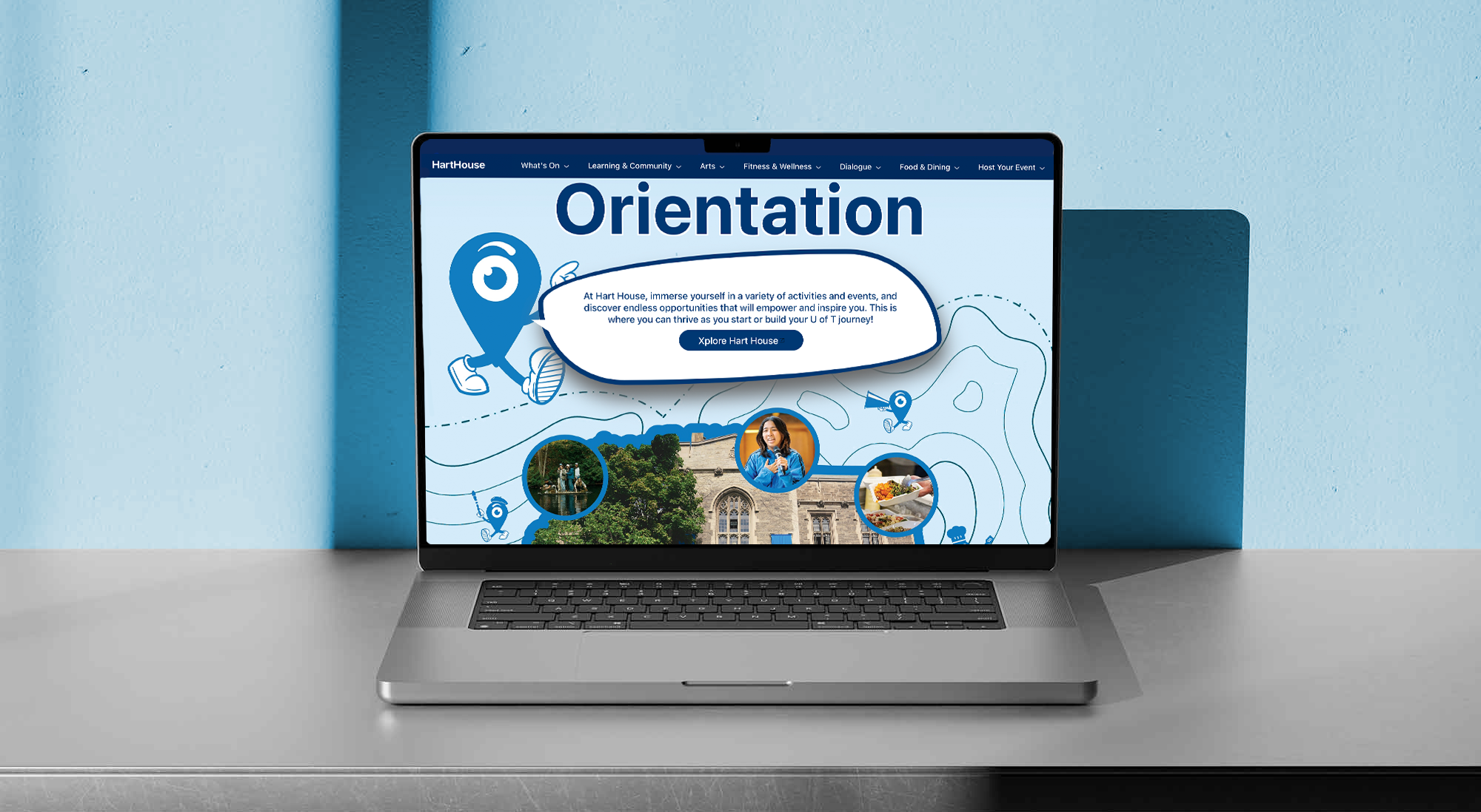
Xplore Microsite
Xplore
Digital signage takeover
Simple mascot animation, graphics and video were used to program the digital screens at the information desk for two weeks leading up to and the day of the event. From a user experience perspective, this is the first point of entry/contact with visitors, and where they go to get information about the days events.